Nala Patient Chair
Continuum for Herman Miller.
Patients heal faster when they get out of bed and start moving. The patient chair is a transition between bed and mobility, and Nala helps patients make that transition easier.
The visual metaphor is a blanket that is both comforting and reassuring. Early sketches were light and flowing to create a sense of being lifted and optimistic- especially in relation to all other products in its category. Manufacturing realities and regulatory constraints readjusted these early visions, but Nala gets high marks in its functionality and comfort.
Nala was designed to be easy to get in and out of and required little effort for the patient to adjust the seatback. We also made it easier for the caregiver. Both arms can raise up and out of the way to make it easier to transfer higher need patients into the chair from the bed.
For the hospital, the surfaces are made from a non-porous and highly cleanable material and can be replaced or updated if needed. The armrests are made from a highly resilient closed cell foam that can stand up to long term wear.
Nala is an extremely comfortable chair, and has been well received in the market.
Avidea Home Theater System
Continuum for Boston Acoustics
This was Boston Acoustics first entry into the home theater market. We helped develop the overall architecture and defined the outside enclosure for all components. What is most satisfying about this design is how well it held up. In 2004 most companies in this category were following Apples lead and were creating products that were very sculptural and translucent. We stayed closer to traditional audio component language and materials - leveraging the history of the brand.
Some of the earlier concepts were even more minimal, and I had hoped to get it that far, but this was a big step at the time. The satellite speakers are made from extruded aluminum, and the main visual detail is a simple dovetail connection between the stand or wall support. The console has a simple LED "map" around its primary display to indicate which speakers are active. A slot load drive takes the disk instead of a drawer- new to that category at the time.
Zarafina Tea Maker
Continuum for Zarafina (Jarden)
This was the first product launched under the newly created Jarden brand, Zarafina.
The tea maker controls the ideal water temperature, steep time and tea type for a consistently brewed tea. Personal settings capture differences for individual tastes.
Because of the strong tea heritage, the design emphasizes the rituals of tea and downplays the appliance aspect as much as possible. It also needed to differentiate itself from coffee makers. Unlike coffee, which is more of an individual experience and connected to ramping up for a busy day, tea is about slowing down and is often a social experience. To differentiate it, I stayed away from cylindrical shapes and instead choose a racetrack shape that is positioned it behind the strong icon of the teapot -which is the focal center. Though not part of the original scope, an early sketch captured the idea of an integrated tea service which shaped the future product. To downplay the appliance aspect even more, the brewer can be removed from the tray and two cups fit in its place.
Beauty Care Brand Exploration
Continuum for a large cosmetic company
This is a good example of design language expressing the qualities of the brand, because the product is so simple and the brands are intentionally very different. The forms and images were developed for a client- but the graphics and labeling have been changed for confidentiality.
Five different brands were being defined, and we were helping them articulate the visual identity as well as tightening the brand messages for each. These are two of the five. I helped select the images used in the image boards as well as developing these structural packages to capture the essence of the visual language for each "brand". Though the products themselves are the same, the character for each is very different.
Using form to express the qualities of the brand is something that I do very often in many different categories. Being able to communicate through form is one of my favorite parts of design because it taps into people’s emotions and shared experiences.
601
Wrap around watch
This is a watch Ive been working on for a while. I came up with the idea of a strap that comes up and around the watch face to capture it. Different length bands would be paired up with different mechanisms to create a personalized watch that fits just right and creates a very integrated, form fitting design.
I took out a provisional patent in 2006, but after researching patents I learned that that the average cost of defending a patent is in the millions of dollars- If you don’t have the funds to defend your patent, then there’s no point in getting one.
I worked on a concept project that used this approach and it showed up on a few sites in 2008 http://www.tuvie.com/with-link-child-locator-hopefully-no-more-missing-children/http://www.yankodesign.com/2008/05/29/tech-that-lets-you-connect-with-kids/
Within a few years I’ve seen several watches and wearables that do this, and have always wondered if they were influenced by this design.
The strongest part of the idea is that it based on an architecture that could be executed in so many different ways, and the unifying element is the action and not necessarily the form.
Lightweight chair
I visited Gaudi's Sagrada Família in Barcelona and was inspired by a model he built to figure out the most efficient way to transfer the weight of the roof though the columns. His idea was to angle the columns in the direction of the load to minimize their scale and create a sense of lightness inside the church. Gaudi came up with a clever and simple model to help him visualize this angle. He weighted bags to represent the weight of the roof, hung them from strings to represent the columns, and used a mirror to see how the strings were directed in the right orientation.
I was trying to take the same approach of lightening the structure of the chair by directing the weight to the legs in line with the force. I wanted the aesthetic to be light and flowing.
The structure is made from an assembly of standard tubing connected by sculpted castings that create smooth transitions. Support at the top and bottom edge comes from a bar that sweeps out of the area you would feel. Fabric is pulled tight to create the flexible surface in a similar way as many common office chairs. The fabric transitions into the wooded leg and gives the chair a light and integrated aesthetic.
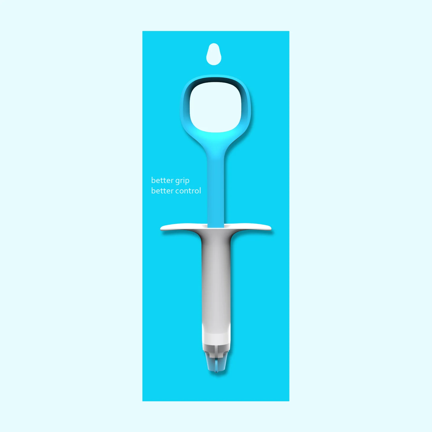
Concept for an improved Epoxy Applicator and Packaging
Edge Vacuum System
Continuum for Oreck
Based on in-home research, the Edge Vacuum System is designed for the way people clean. Without realizing it, most people already have cobbled together a cleaning system. In the US, people generally use uprights to clean large open spaces. Many also own smaller mobile vacuums for quick event and spot cleaning. The Edge Vacuum system recognized this and was designed to be a complete cleaning solution.
Oreck’s brand balances two somewhat conflicting attributes- Lightweight and Powerful. The visual decisions were made based on delivering these two messages. Elevating a bag vacuum was one of the bigger challenges of this program. Most vacuums of this type used a literal bag stitched from flat stock material- which resulted in a very dated aesthetic. We utilized a molded EVA foam to pull this format forward. The forms are integrated while still allowing much of the structure to be exposed as part of the look.
The mobile was based on a metaphor of a handbag to communicate lightness and mobility. The hose is integrated into the handle when it’s not in use.
The Edge Vacuum System received an IDEA Bronze Award
Bunn MyCafé Single Sever Brewer
Continuum for Bunn
Based on the paper pod consumable, the MyCafé makes individual cups of hot beverages. The pods are a more ecologically responsible solution than the standard k-cup. Many people also feel that the taste is better, and there is some debate as to the health consequences of plastic pods.
The design is as straight forward as possible. A simple stainless backsplash creates the right stage for the cup, and a simple button starts the brew. No LCD interface or clocks. Water is filled in over the brew area, so that it feels more direct and is easy to get to. The height of the brewer has been reduced down to its minimum so that it can live easily under cabinets and doesn’t need to be moved every time it’s used. To keep this height at its lowest, and to simplify the design, the tray can be removed to accommodate large travel mugs.
Playtable
Altitude for Lego
Lego was looking for a cost competitive design that could be produced in the US or Europe, but still compete with a lower cost knock off that was taking a lot of their market share.
This design was chosen because of its straightforward approach to the block storage. It also minimized the number of parts and was a very robust and safe design.
The shape of the legs and the swelled “belly” loosely reference an animal to animate the design. We stayed well away from being a literal animal, but there’s enough of a reference that you pick it up.
This is still one of my favorite programs and the product was on the market for many years.
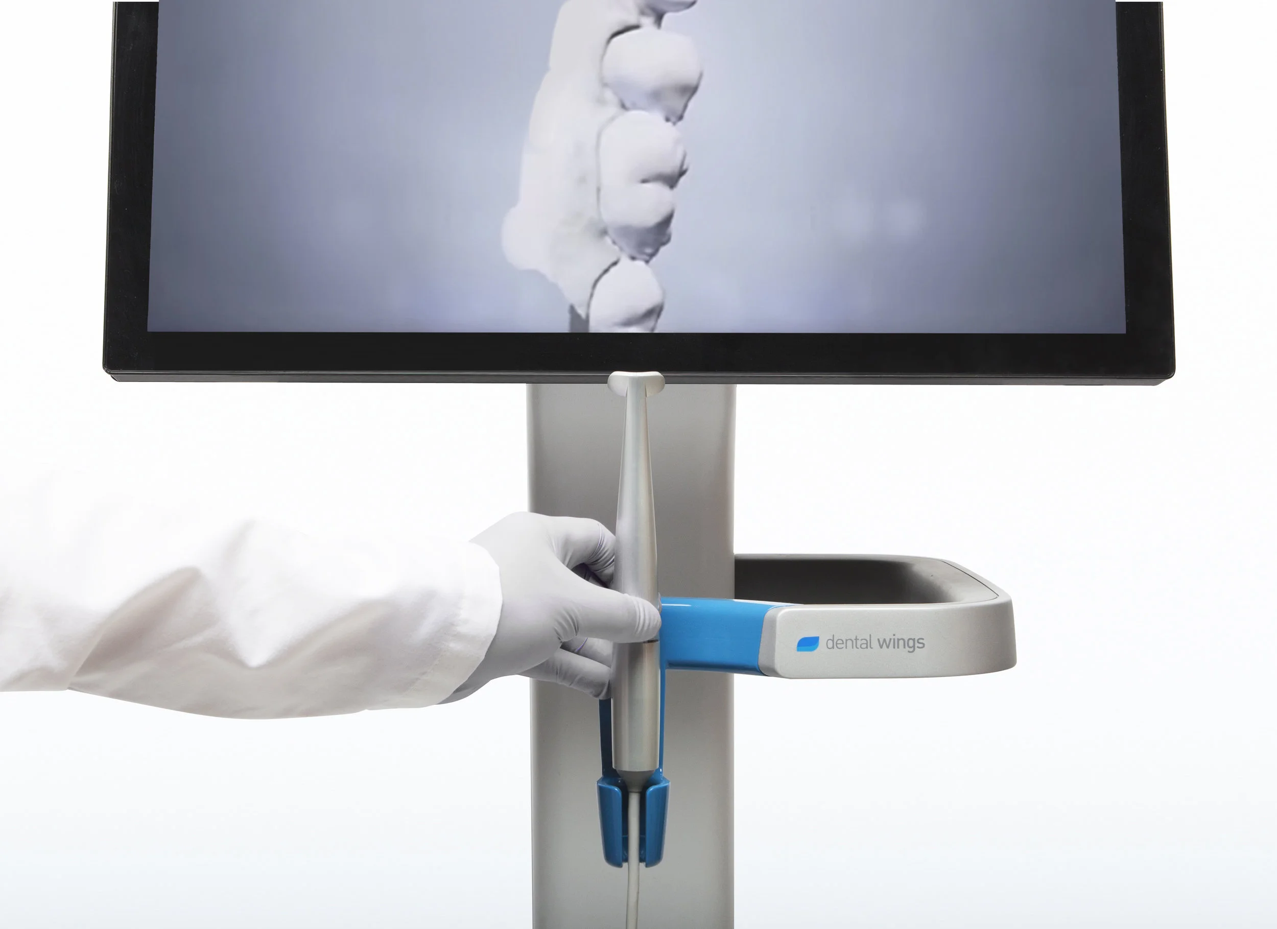
DWIO Dental Wings Intraoral Scanner
Continuum for Dental Wings
Digital impressions translate a patient’s 3D dental information directly into a digital format so it can be used to design and build custom dental prosthetics.
3D digital scanning is a relatively new technology and products in this category are usually large, awkward and cumbersome to use. The experience is usually tedious and slow, as it often requires each tooth to be individually scanned and processed. The Dental Wings Intraoral Scanner is a big leap forward over most systems available today. The handpiece is the smallest, lightest, and most agile device on the market and instead of individual images, its micro cameras are capturing 3D video and reconstructing it in 3D in real time. This creates a much more fluid and seamless integration into the dentist’s workflow.
The cart was designed to be an agile assistant- holding the handpiece front and center for each use. The display is set at an ideal height and can easily pivot up or down. The casters and a 360 degree handle makes it easy to grab and position. A gesture control interface allows navigation through the most common controls so that the screen is untouched- reducing cleanup and infection points.
The handpiece design is a careful balance between ergonomics and functional constraints. The arc was already determined as the best way to capture digital information from all sides of the tooth simultaneously. After many consults with dentists, we determined the right ui, center of balance, and textural feel.
CLX-T Xenon Light Source
Continuum for Luxtec
Surgeons require an intensity of light that is hard to generate on a headset. Luxtec is a leader in lighted surgical headsets. An intense Xenon light, generated in a remote box, travels through a fiber optic cable to a lens on the headset. The light is projected as closely as possible to the surgeon’s line of sight.
We were asked to help develop and improve their existing light source. Though the problem was mostly framed as an aesthetic update, we also looked for ways to simplifying the interaction. The large dial makes it easier to adjust the light intensity and its proximity to the port makes its function more obvious. The ring also allows for an easier way to manufacture different versions. Single or multiple port turrets can be swapped out sharing most of the same housing components.
The design was later used as a reference point for a family approach to future products. The sketch shows some exploration around translating the visual language of this product into other formats
Continuum for Insulet
Insulet approached Continuum with a groundbreaking concept- a self-contained “on body” insulin pump controlled with a wireless device. This untethered approach helped people to integrate their diabetes management more seamlessly into their lives.
Insulet needed help adapting their engineering breadboard into a high volume consumer product. My role was to help shape the pod and controller. The design of the pod was driven primarily by the desire to make it as transparent and integrated with the body as possible. Because the architecture was already unconventional, we wanted to make the controller non-medical, and familiar- For that reason the shape looked more like PDA’s and cell phones at the time- pre iphone! This aspect was recognized by IDEA jurors who said “From a patient’s perspective, this design reduces to the perception of a healthcare product to that of a digital assistant. Overall, this system is leading the direction of consumer medical products.” --Tor Alden, IDSA, principal, HS Design Inc.
The Omni-pod received an IDEA gold. I still feel very proud knowing that I was part of a team that helped improve many people’s lives in a meaningful way.